Viva Topics Integration in Outlook

Viva Topics Integration in Outlook

Viva Topics Integration in Outlook

The UX Tug-Of-War: How I navigated conflicting business goals to boost Viva Topics' daily active usage in Outlook by 29%

The UX Tug-Of-War: How I navigated conflicting business goals to boost Viva Topics' daily active usage in Outlook by 29%

The UX Tug-Of-War: How I navigated conflicting business goals to boost Viva Topics' daily active usage in Outlook by 29%

Role

Role

Lead Designer (Outlook)

Year

Year

2023

Platforms

Platforms

OWA (Outlook on the Web)

New Outlook on Windows

Teams Involved

Teams Involved

Outlook Feature Design (Me)

Outlook Design Framework (Toolkits)

Viva Topics (1st Party Partner)

OVERVIEW

We all think of Outlook as the place for reading and composing emails, but it's also a productivity hub where millions of enterprise users supercharge their workflows with 1st- and 3rd-party plugins.


We had the opportunity to work with one such partner that developed 1st party plugins to integrate into our app, Viva Topics. This team enabled users to seamlessly access information while working in apps like Word or PowerPoint, reducing the need for reactive searches.


However, managing partnerships presents unique challenges -- The design team within Outlook had earned a reputation as a 'UI gatekeeper,' driven by the necessity to establish design principles after years of clutter and inconsistent patterns. As a hub for plugin integration, our challenge was striking the balance between developer freedom while preserving the core user experience of email composition and reading.

the challenge

How might we strike the perfect balance to ensure customer satisfaction, drive user adoption, while aligning with all 3 partners involved?

How might we strike the perfect balance to ensure customer satisfaction, drive user adoption, while aligning with all 3 partners involved?

Approach & Strategy

Approach & Strategy

the problem

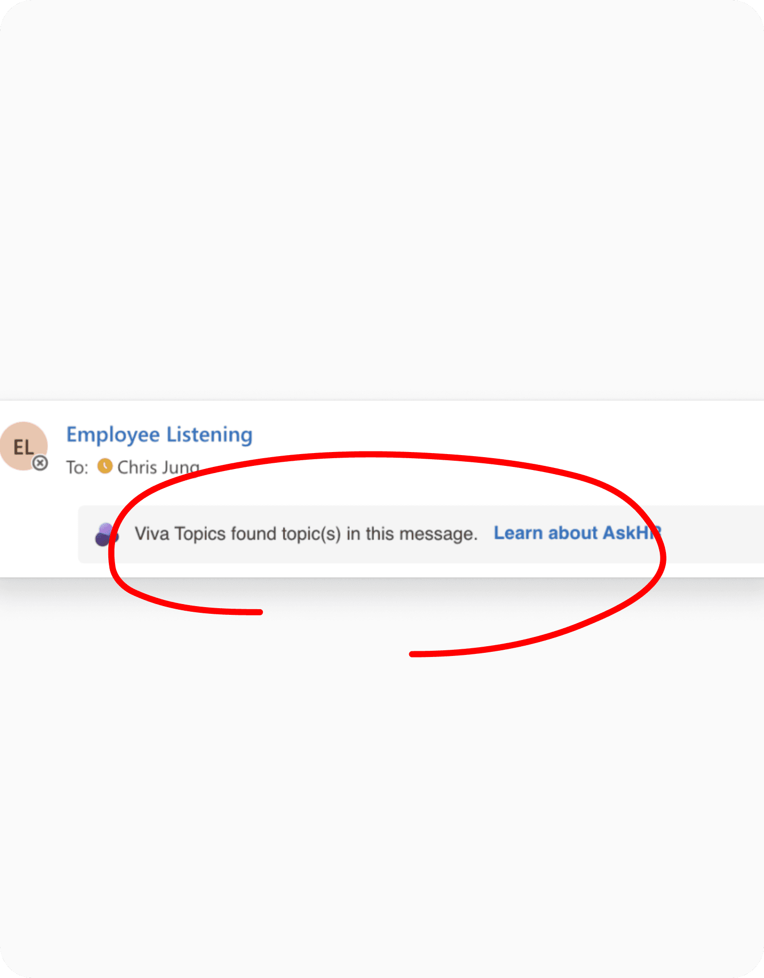
Existing Viva Topics integration in Outlook was cluttering, non-contextual, and lacked visual coherency.

Existing Viva Topics integration in Outlook was cluttering, non-contextual, and lacked visual coherency.

cluttering of the subject header

Without clear design guardrails, any partner team can implement their experience in our header. This led to clutter and visual inconsistencies.

Without clear design guardrails, any partner team can implement their experience in our header. This led to clutter and visual inconsistencies.

Discovery UX feels detached from email

While we should minimize context switching and help users discover new content at the right moment, we weren't currently doing so.

While we should minimize context switching and help users discover new content at the right moment, we weren't currently doing so.

intrusive & distracting ui

Message banners help discoverability, but users found them intrusive and distracting from the main reading pane content.

Message banners help discoverability, but users found them intrusive and distracting from the main reading pane content.

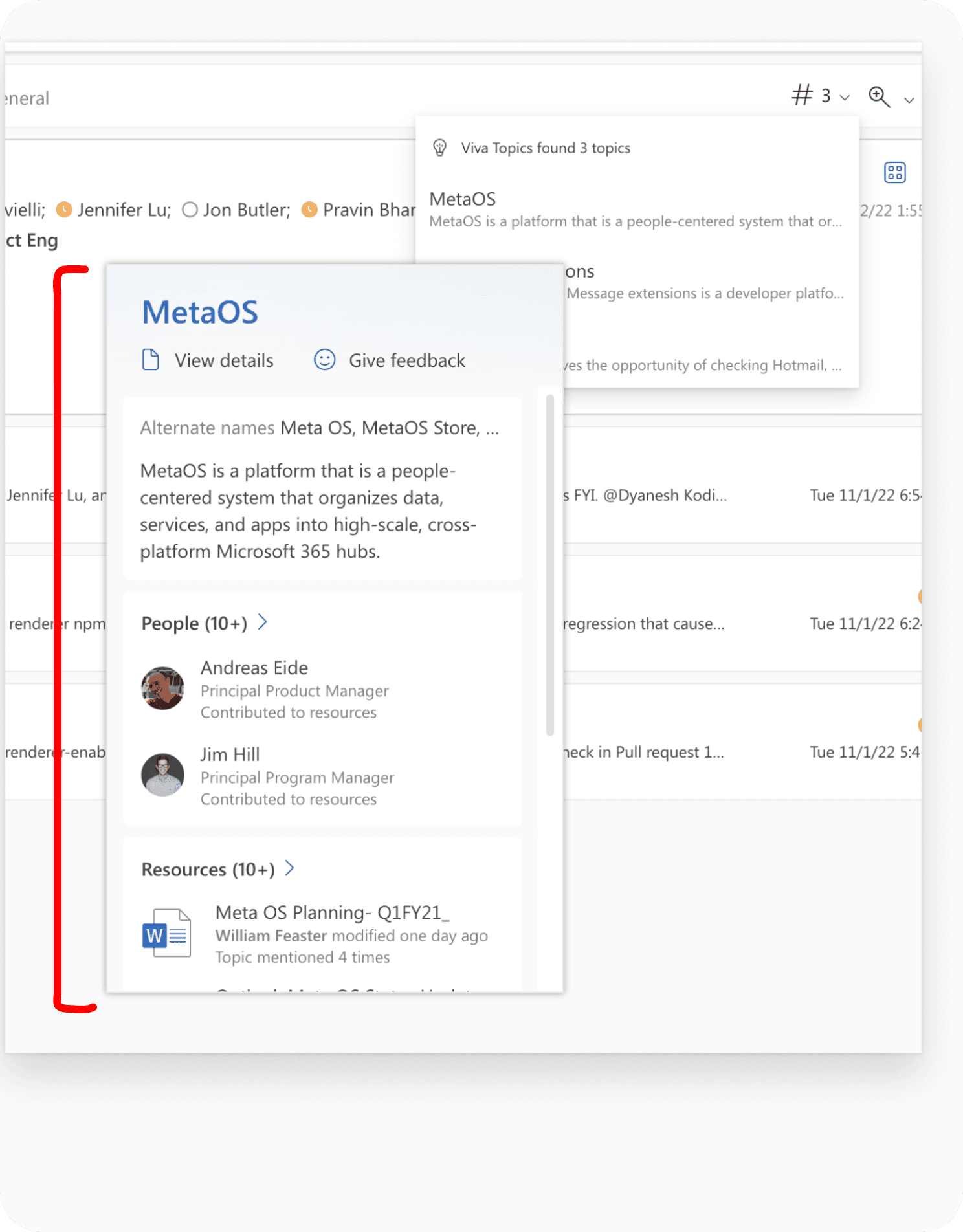
Popover over a popover

Stacking UI elements with depth caused a disjointed visual experience for users and deviated from established Outlook patterns.

Stacking UI elements with depth caused a disjointed visual experience for users and deviated from established Outlook patterns.

THE PROBLEM

The solution seemed obvious at first, but we quickly hit a roadblock

Post-audit, it seemed obvious that the UX should be contextual and inline, showing up near the actual topic, on a message-level as opposed to users having to reactively hunt if an email has topics. But that’s when the Design Framework team on Outlook challenged us on whether new UX was even worth pursuing given the current low engagement with existing features and the potential risk of cluttering the reading pane.

the challenge

Opposing goals across three teams was the biggest challenge

Opposing goals across three teams was the biggest challenge

VIVA TOPICS AIMED TO

Enhance discoverability and engagement

Enhance discoverability and engagement

framework aimed to

Maintain craft and reduce clutter

Maintain craft and reduce clutter

feature design aimed to

Retain good partnerships and create seamless UX

Retain good partnerships and create seamless UX

PROBLEM SOLVING

Why couldn’t we simply look at MAU to decide whether this feature was worth the effort?

We currently have 392 million Monthly Active Users (MAU) on Outlook, and only 0.02% of these users utilize Viva Topics. At first glance, it’s easy to deem it insignificant. However, this percentage represents 80.6k paying users who actively use and find daily value in this UX.


Therefore, we couldn't just axe a feature based solely on one metric.

Proposal & A/B Testing

Proposal & A/B Testing

our strategy

A proposal that benefitted all 3 partners was key to our strategy and successful in getting buy-in

A proposal that benefitted all 3 partners was key to our strategy and successful in getting buy-in

RATIONALE #1

Potential to impact tens of thousands of customers

Potential to impact tens of thousands of customers

RATIONALE #2

Proposed UX would only be on for paying tenants

Proposed UX would only be on for paying tenants

RATIONALE #3

An 'inline' UX balances discoverability with subtlety

An 'inline' UX balances discoverability with subtlety

RATIONALE #4

Viva was committed to iterating on feedback

Viva was committed to iterating on feedback

THE SOLUTION

A/B experimentation allowed us to intentionally keep our options open

Our strategy consisted of A/B testing two treatments, one prioritizing visual subtly (Ghost) and the other prioritizing discoverability (Persistent Highlights).

Ghost Treatment (Recommended)

Ghost Treatment (Recommended)

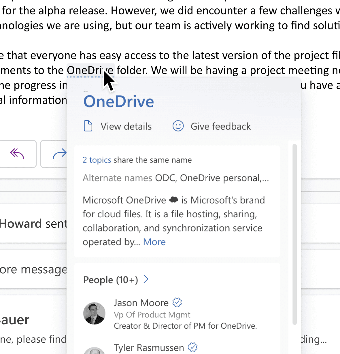
Topic highlights are hidden by default, only appearing when users hover on a Topic’s target area.

Subtle Treatment

Subtle Treatment

Topic highlights are on by default, prioritizing discoverability and proactively aiding users

ux hypothesis

If topics are ‘quiet’ by default (Ghost Treatment), we hypothesize that this will enhance UX by enabling users to focus on content, preserving sender markup, and appearing only upon user intention.

business hypothesis

If topics are ‘quiet’ by default (Ghost Treatment), we hypothesize that this will enhance discoverability and elevate engagement among active users, as interaction becomes more deliberate.

If topics are ‘quiet’ by default (Ghost Treatment), we hypothesize that this will enhance discoverability and elevate engagement among active users, as interaction becomes more deliberate.

ENCOUNTERING SPEED BUMPS

Surprising results helped us realize we weren’t tracking the right metrics

Surprising results helped us realize we weren’t tracking the right metrics

To our surprise, the Ghost treatment yielded higher Topic card opens but not for the reasons we hoped for.

Because Ghost highlights are hidden by default, and a good number of users read emails using their cursors from left to right, users accidentally discovered these highlights more often than in Subtle treatment. From this, we realized measuring the number of card opens doesn’t necessarily = positive user value. We found out that these highlights distracted more than helped.

New Definition Of Success & 2nd Round Of Testing

New Definition Of Success & 2nd Round Of Testing

We started tracking card dwell times for round 2.

Caption: Dwell time is the amount of milliseconds (ms) a user hovers on a piece of UI, which in our case is the Topic keyword

Caption: Dwell time is the amount of milliseconds (ms) a user hovers on a piece of UI, which in our case is the Topic keyword

impact

Results showed an increase in dwell time for the Subtle treatment, signifying engagement and validating our hypotheses

Results showed an increase in dwell time for the Subtle treatment, signifying engagement and validating our hypotheses

Dwell time

>500ms

Engaged active users

+29%

After a 2 week experiment, even though the number of Topic card opens on Subtle treatment was lower, the amount of time hovered on the card was higher.


This meant that users intentionally engaged with Topic cards more in this treatment and actually counted as an engaged user.

Impact

Upon shipping worldwide, engagement and retention skyrocketed

Upon shipping worldwide, engagement and retention skyrocketed

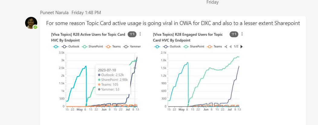
Within the first few weeks of shipping WW, we instantly noticed a significant increase in DAU and MAU compared to existing UX.

Caption: Exponential increase in 3k to 50.4k MAU (monthly active users) post-feature rollout in the months of May-July 2023. Worldwide audience sampled at 5%.

Caption: Exponential increase in 3k to 50.4k MAU (monthly active users) post-feature rollout in the months of May-July 2023. Worldwide audience sampled at 5%.

collateral wins

Along the way, I also implemented teaching UX for this new experience & contributed to the Subject Header redesign

Along the way, I also implemented teaching UX for this new experience & contributed to the Subject Header redesign

A few other positive outcomes indirectly came out of the inline Topics work, including the redesign of the Subject Header as well as Tips cards.
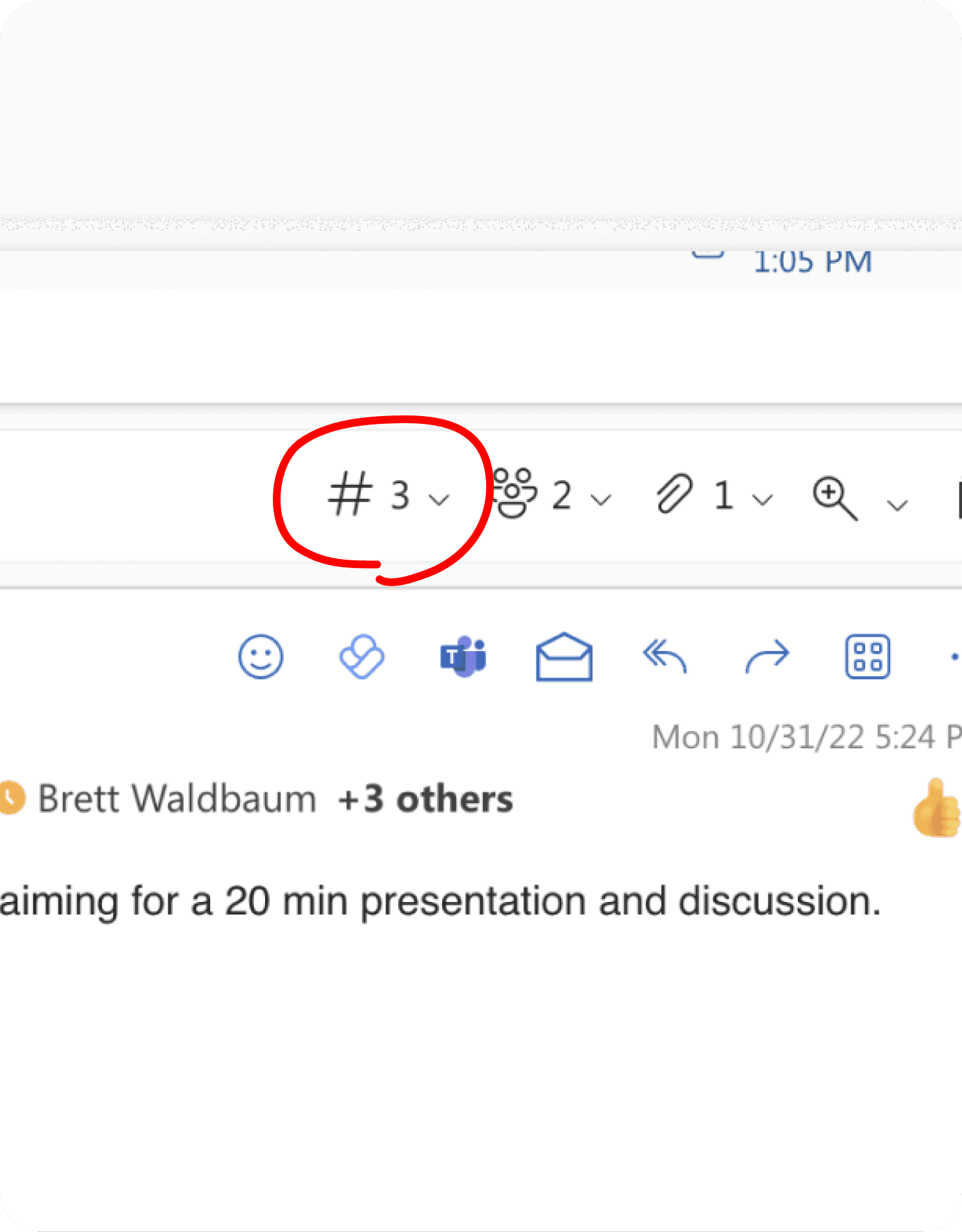
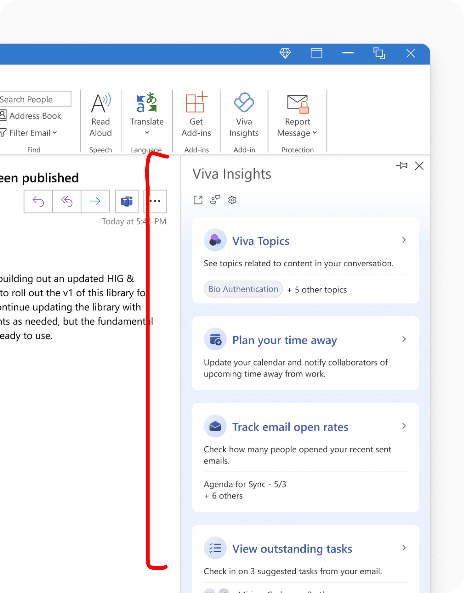
Subject Header Before

Subject Header Before

Cluttered Reading Pane header that didn’t respond well to small screen sizes

Cluttered Reading Pane header that didn’t respond well to small screen sizes

Subject Header After

Subject Header After

Redesigned Reading Pane header with expand and collapse functionality (Lead Designer: Dana Shin)

Redesigned Reading Pane header with expand and collapse functionality (Lead Designer: Dana Shin)

Tips Card

Tips Card

Introduced a Tips card in the Tips pane to help users learn of new features. Collaboration with motion designer, Colin Moll.

Introduced a Tips card in the Tips pane to help users learn of new features. Collaboration with motion designer, Colin Moll.

Thank you to the team that made this possible

Thank you to the team that made this possible

Outlook

Outlook

Thomas Constantin (PM)

Thomas Constantin (PM)

Dana Shin (Design Toolkits)

Dana Shin (Design Toolkits)

Colin Moll (Motion)

Colin Moll (Motion)

Justine Du (Design Lead)

Justine Du (Design Lead)

Viva Topics

Viva Topics

Marc Pasarin (Eng Manager)

Marc Pasarin (Eng Manager)

Eric Gradel (PM)

Eric Gradel (PM)

Luis Tovar (Eng)

Luis Tovar (Eng)

Made with love and caffeine © 2024 Justine Du. All rights reserved.

Made with love and caffeine © 2024 Justine Du. All rights reserved.